| Home | News | Demo and Game Reviews | Serious Stuff | Travel Reports | Multimedia | Humour |
"The Outline 2011 Atari Demos and Intros?"
Here's a selection of reviews, bundled into one, written around a year ago to follow on from the Outline 2011 party. They were intended for a diskzine which did not quite come off at that time. As these reviews have not been used and still very much exist, we thought it would be reasonable to give them a chance in here.
CiH - November 2012.
'Blue Period' by Paradox
(Atari STe, MegaSTe or Falcon 030. 2 MB RAM.)
One of the undoubted highlights of Outline 2011 was this demo, produced by Paradox. What is more incredible is that this was literally a 'party production', as in "Hey kids, let's make a demo with this stuff we've got lying around on our hard drive, right here!" Well it would have gone like that if 'The Kids from Fame' was still being made, and featured a demo scene episode.
Well with 505 playing the curly-haired muso Bruno, Paranoid taking the role of the dance teacher played by Debbie Allen and Dan and RA combining as one into the be- muscled torso of Leroy, the tough kid with the winning dance steps, they came up with the theme of a demo all in blue, similar to Picasso's 'Blue Period'. Ukko also donated a logo as he was one of the kids in the art class.
A bright and floaty soundtrack by Dan with some digi-drums starts off. As the demo progresses, a bit of SID harshness creeps in.
A title picture in an old school Thalion style logo fades in and out to the beat.
As the tune gets past the intro, the first main effect comes in. This is a horizontally scrolling logo with a radial central light source, all in shades of blue. This is described in Paradox's excellent documentation as a blitter radial blur and as the oldest effect in the demo.
The credits screen follows quickly, with 31 greyscale or 'blue scale' shades on display. The picture is in a pleasantly high resolution. This builds on similar things seen in earlier productions, I'm thinking of a past Alt Party intro with a neat interlaced text displayer for some reason.
A swirling tunnel arrives hotly on the scene from there. From the behind the scene notes, this is quite a high concept screen, with the full impact possibly lost to some extent amongst the never-ending shades of blue. A full ST-resolution background of 320 x 200 can be combined with a lower resolution effect without unwanted chunkiness and some other stuff going on too.
The greetings screen follows, reusing the 31 blue scale shader once more.
The next major effect is an appealing variation on an old demo staple of circle interference. In this version with heavy blitter usage, we see something more akin to 'circle co-operation', where different parts of the effect blend and reform into each other. The viewer gets an appreciation this is more of an STe specific effect and it breaks up the relentless blueness of the rest of the demo with some appealing golden patterns.
A quick stab of a logo precedes the finale. (Thank you Ukko!) This last effect was the real moneyshot moment from the Outline demo competitions. Apart from the stuff that we saw in 'Natrium', but that is a whole other review.
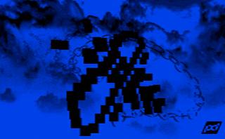
It starts quietly with a blue pictorial background and a stark black blocky bumblebee, the famous Atari ST mouse 'busy' graphic, also the logo for the Outline parties, as seen on a large part of my t-shirt collection.
What happens next is sort of expected, but immensely satisfying to see anyway. The apparently static and unexciting bumblebee starts spinning on its axis, revealing itself to be an object with an extra dimension. What we get is not quite 3-D, but the object is made up from blitter based rectangles to give a pretty fair impression of the famous flying bee from Checkpoint's 'Underscore' demo.

This spins languorously for some long seconds, then the whole demo fades to black. As befits a party-made demo, there isn't really a proper good-bye.
So that was Paradox's 'Blue period', pulled from the spur of the moment. Well we're not feeling blue from seeing this fine production. We look forward to more of Paradox's finely-written effects on the STe in due course.
Ratings.
Graphics:- 80% - The 'blue' theme features strongly here.
Sound:- 80% - 505 does the job once more.
Tech:- 90% - Strong Blitter abuse carries the day.
Overall:- 85% - Short and sweet party production.
Natrium
by Rave Network Overscan (RNO)
The 96k competition at Outline 2011 was won in convincing style by this production. We have long time Commodore Amiga fans, RNO or Rave Network Overscan to thank for this mini-epic on the ST.
This is not quite their debut effort on 'our' platform, as some readers might recall a little intro called 'Sodium', which guest-starred at an Alternative Party a couple of years ago. This featured some nice effects, including a twister which was considered quite a way up front for state of the art on the Atari ST. How have the last eighteen months treated the coding fingers of Britelite and company?
Well it seems that having spent a bit of time has helped nicely. The intro kicks off with a nicely burbly sound chip tune with a loose tunnelly sort of effectflowing towards the viewer. A semi-transparent RNO logo pushes to the front, demanding to be noticed, then the demo title takes over, borrowing the same font. This all fades off to make way for the proper 'opener'.
The vague tunnel of the first part has clarified into a full scan golden texture mapped creation. In a nod to keeping the speed up, the window has been reduced to the left half of the screen. In a nod to design, an attractive female profile graphic takes up a window on the right. It is 'design' in the obvious sense, but it is clean and well-presented and therefore works. Much of the rest of this demo follows a similar theme.
Which abruptly switches to a lens or 'hall or mirrors' distorter, just four colours for the image it is using, but done quickly and smoothly.
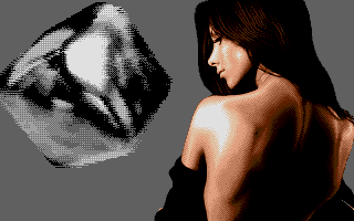
This screen folds into the centre to allow the next effect. This repeats the right-left dichotomy of the previous screen, with a stunning rough-textured shiny cube spinning about its axis on the left, pretty lady on the right sort of thing.

This goes away too quickly but leaves another visual treat in its place. Yet another pretty lady taking the whole screen, no action elsewhere, but I suspect the maximum use was gained from the sixteen colours and shows every sign of a superior artist on that job. Credits for the individuals involved are shown, Britelite in the lead for code and graphics, other graphics by Bracket, and 505, taking over Mad Max's ubiquitous role, for the music.
That is out of the way and we get a return visit from an old friend. This is the gorgeously shaded twister that first made an appearance in 'Sodium'. Only it has gone completely horizontal, but remaining as smooth and flowing from the first time around. A short series of group greets flash top and bottom.
A further spasm of 3-D niceness follows, with a return of the shiny metallic lightsourced(?) object. this time, it is a solid pentagon, an 'almost torus' with yet another high-concept high maintenance female off to the right.
The final effect follows, although we do not know this at the time. A close-up of the shady lady from the last screen, and about fifteen seconds worth of a zoom and rotate texture. Another staple of demo makers since the times of Sanity (And you might recall he considered the ST to be superior zoom and rotate territory!) Again, clever use of the limited colours gives an impression of more being used.
Then it's suddenly over.
I guess one thing about the 96k category is, that you get so wrapped up in what you're doing, you run out of space to say goodbye?
This was certainly a superior effort from RNO and we sincerely hope they will be motivated to release more for the Atari. Now what would happen if they got hold of a CT60?
Ratings..
Graphics:- 85% - Nice textures and still graphics, looks like they went chunky or limited colours in places to keep up the speed?
Sound:- 80% - A workmanlike tune from 505. Reminiscent of some Error in Line 99 ST demos.
Tech:- 85% - Nice speedy effects verging on very impressive.
Overall:- 88% - A very well executed 96k entry indeed.
Outline 2011 Smaller stuff
Here is a rounding-up of the smaller releases from Outline 2011. There are some nice ones in there, that rounded up the overall activity level from that party to a pleasing level.
Superstar - Positivity/Sector One
In an intro competition that had Natrium sweeping all before it, this creditable effort took a deserved second place.
Perhaps seeing the lack of entries for the 96k intro category, this intro came about from an in-party collaboration of Ukko, DMA Sc and Baah!
There is a clear and straightforward style throughout. The effects were kept to the background, with a clear line drawings at the front (or to the side where a twister was used.) There was nothing here that was limit breaking, but all the effects were smoothly done with a nice progression.
The intro was topped and tailed by a couple of pieces of neat Ukko artwork and with a relaxed funky DMA-Sc tune for the whole thing.
Rating:- 75% - Superior party filler.
STMP3 - MJJ Productions
This managed second place in a not overcrowded main demo competition. Tobe opted for a 'technical' approach to his latest effort. Following on from his work on the chunky pixel video player seen previously, Tobe opts to make a 'sort of MP3' for the STe.
The screen when running is sparse, with some level or volume indicators the only signs of movement with some text. Sound-wise, the eerie and distorted tones of Janelle Monae's Cybernetic Purgatory drizzle out of the speakers. This does sort of work, even after listening to the eerily beautiful original.
The best sport comes when you contemplate the file size to amount of sound you are getting. The whole thing, executable code and soundtrack combined in one file, comes to a grand total of 131096 bytes in length. No, I did not miss a zero off anywhere! That gets you 1 minute and 37 seconds of music. I'm only slightly exaggerating when I consider this could turn even a floppy-only STe into a fair impersonation of a poor man's iPod.
I seem to recall hearing after this was released that Tobe was working on some sort of full media application for the STe. Bring it on! I say.
Rating:- 75% - The potential is interesting for this one.
128Sync - Checkpoint
With 128 bytes to play with, there's not a lot of space to be really expressive in. Somehow, Defjam manages it, and keeps coming back to this category, time and time again.
A single screen attempts to pack in as much as it can, with what can be described best as a distorting test pattern. A 'wall of sound' hits you, a combined sound chip 'zap' and furious key-clicks. This intro produced some very strange reactions from the watching Outline 2011 audience, so some hidden hypnotic properties were probably coded in too?
Rating:- 70% - A feature rich single-screener with cult worshipping properties!
Random cell - Positivity/Arm's Tech
This was the sole boot sector entry, so was combined into the main demo competition where it picked up a creditable third place. Upon running, the screen displays a seemingly random collection of pixel splats. However, the more observant viewer will spot a meaning to the apparent chaos. A closer scrutiny of the readme. text reveals that Baah! has been playing around with the really really old school concept of the cellular 'Life' game.
The old formula has been tweaked with some probabilities, for the coders among you, there have also been some epic feats of compression with 39438 bytes crushed screaming down to 418 bytes via a packer of his own making. The depacker only needs 42 bytes!
There is even some music from Cyclone, so where the heck did he get to?
It's not pretty to look at, but demo fans with a bit more knowledge will appreciate the effort put into this one.
Rating:- 66% - Hidden beauty, crouching tiger.
-
Strictly speaking, this final intro is not part of the Outline 2011 collection, but it got itself included in this batch of reviews anyway - CiH
Sommerhack 2011 Invitro
by the Dead Hackers Society
The Sommerhack series of demo parties are a small summery gathering of some of the most dedicated Atarians in Scandinavia and sometimes from further afield. We have had a high rate of quality releases from this small party. This reviewer fondly recalls such classics as 'TalkTalk 2' - the church of excellence in art'and the more recent 'Summer Delights'.
There has also been a tradition of nicely prepared invitro's for the Sommerhack party, including a nice one for the CT60 series a while ago. This year happily continues the good run of these, but targeting a less aggressive hardware platform, the not so insignificant STFM. The base requirements are fairly benign too, going as low as a 1990-friendly 1 MB STFM for the floppy disk version, with 2 MB needed for the hard disk variant.
In recent times, the Dead Hackers Society have concentrated on the enhanced ST, the STe as their platform of choice. A number of extra features, such as fullscreen effects and use of the enhanced palette have been used. It also seems to be easier to include some nice lengthy sampled soundtracks as well. So the question posed this time, is whether we're going to see more treats in line with the recent run of Dead Hackers productions, or if they're going to have to cramp their style for the less enhanced STFM?
Starting up, the omens are good, with a confident bassy soundtrack kicks in, a very subtle dotted background forms up, then an onrushing star field effect but with big blobs screams at the viewer at blinding speed. It's fullscreen, there has been no cutting back from the high standards set on the STe. A series of credits flickers on to the screen.
The music is by Xia of Excellence in Art, who plays a big role for these parties, one way or another. Graphics are accounted for by DHS stalwarts Proteque and Evil, with code from Gizmo and Evil. These are completed and the effect fades out.
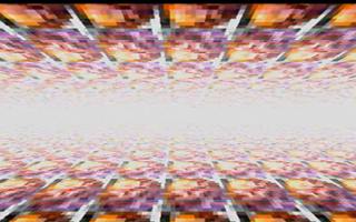
The music bursts into an ecstasy of lead-line and a huge screen of fullness is presented once more. This shows off a floor and ceiling SNES mode 7 texture scrolling towards you, then sideways, then seemingly in any damn direction with a wavy distorting feeling. The heavenly brightness at the centre of the screen fills out and fades out this effect.

Something of a quieter interlude, but still screen border defying with a pretty femme donated by Proteque on the left and a sound wave displayer on the right. This is replaced by an exquisite rippling logo which goes from the bottom to the top and disappears out of sight.
This cleared away, the final 'invite' part of this intro kicks in, with yet more fullscreen wizardry, a coarse blue 'interference' texture scrolls upwards, after a little while, a golden coloured info text scrolls over the top of it at a more genteel place. Fans of party information will appreciate this part of the demo most of all.
A large shed full of greetings follows, with the final message being a timeless one which can not be repeated too often. "Never give up, stay Atari!"
It is all too soon and it is all over. This is shorter than a lot of recent DHS demos. It would be interesting to see if they can stretch to a full sized demo of fullscreen wowness on the STFM? However, this intro remains a triumphant vindication of their excellence and its translation on to the less enhanced member of the ST family.
Ratings..
Graphics:- 87% - Some nice work, STFM palette restrictions not at all noticed!
Sound:- 90% - A kicking sampled tune from Xia lifts the mood massively!
Tech:- 92% - Seemingly effortless translation of STe fullscreen to STFM.
Overall:- 88% - Only criticism is, it's too short!
CiH - 2011 - Reissued for Mag 2012.