| Home | News | Demo Stuffs | Game Stuffs | Serious Stuffs | Travel Reports | Multimedia | Humour |
Sommerhack 2013 Summery Summary!
A welcome oasis in an otherwise barren summer desert of no Atariscene activity, as someone might have said. Sommerhack, for all its small and almost intimate nature, has managed to pull off some big releases. How did they get on this year? Well read on to find out!
Bits #59 - Bits - Atari ST
I ran this file, rubbed my eyes and when I looked up, I momentarily thought I was back in 1989, Reality sank in, took over, and I was back in 2013 with no visible harm done. (The mental scars, another story!) Anyway, a simple screen, rasters, a huge chunky text scroller, some particles wriggling upwards, and the same music as their Outline entry, This is as 'by the numbers' as Bits can get. The numbers in their case being '5' and '9'.
Rating:- 40% - Love of life drained out of my fingers as I typed this.
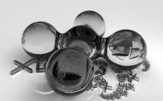
Xak McCracken cracktro - Tumult and tSCc - Atari ST
Another small scale production using rewarmed ingredients. This one at least has some artistry behind it, with some nice painted pixels and ascii on screen, a single biplane flowy twisty thing does its stuff over the ascii logo on the left, with a transparent text scroll at the bottom and a reworked 'Noisy Pillars' tune to complete the package. We have to consider that the cracktro genre is inherently excitement limiting, as it is the packaging or wrapper for the main event which is following it.
Rating:- 55% - A competent display from all concerned.
STePs - Excellence in Art - Atari STE
Moving smartly away from those entries that might be classed as 'filler' by unkind souls, here's the first from a regular participant at the Sommerhack. Yes, a loud cheer is due as Xia lobs a 4ktro at the appreciative audience.
This is one of those intros that builds itself on the screen whilst we wait. I don't think the word 'precalculating' was involved, but I'd have to watch it again to be sure. What draws itself on the screen is the word 'Steps'. A text at the top informs us of an "antialiased postscript with 4x sub pixel accuracy and DMA SIDsynth for your 4MB STE - All in 4k!" The screen is revealed to be a vertically challenging virtual screen, as the logo and text scroll upwards to reveal some vector drawn spinning gubbins going on at the bottom. Scroll the text back down again, repeat with more elaborate patterns at the bottom. The SIDsynth is there, but not doing a lot. I guess 4K can only go so far?
With the downloaded file, is a readme.txt with lots of notes on how this was done, which is well worth a read. There's more from Xia with an exclusive interview for this issue of Mag!
Rating:- 72% - Coolly minimalist 4K worth from a master.
US Policy - Excellence in Art - Atari STE
Here we have possibly one of the most misleading productions on any platform. A spectacular file size, almost 18MB in a compressed Zipfile tells the casual viewer, this could not be anything other than the too long awaited follow-up to TalkTalk 2, Xia's greatest hit from 2010. On the other hand, looking carefully at the release list tells us that the traditional lighthearted party report intro is missing.

I think you can work out what happened next! To be fair, Xia has told us in his (oft-referenced) interview with us, that this was pretty much a last minute effort and not a proper real demo.
That said, there are a lot of smart parts, which will be covered in more detail in a separate review. The self-indulgent nature of the 'party report' side of things sags in the middle, but there is a finale, with streaming audio, which claims to need a fast hard disk, preferably UltraSatan compliant. This is only slightly marred by a stream of random text of the 'Omigod I should have done this BEFORE the party!" nature.
Still, we're pleased to find out that the opposite of white is yolk!
Rating:- 80% - A good rating is mandatory. If Xia is seen, notify the appropriate authorities and do not approach him!
Riverside - DHS - Atari STE
Of course a Sommerhack party isn't complete without something from the Dead Hackers Society releasing here. This year, DHS are taking things quietly, with an seemingly effortless and understated 64k intro 'Riverside'.
A watery theme is decently realised here, with a riverbank plant superimposed over a succession of tasteful blue-themed plasma based effects. The music is classic 505, dramatic and powerfully done. Later, a blurry zoom and rotate gets in there, and a comet tail-chase view lends some further drama. The overall style is low resolution, blurry and very quick. There is a major mood change with some rotating raster bars, captioned 'Winners don't use HAM!' A 'seen before from another demo' follows, namely a zooming textured font scroll text.

We end with a de-merging and re-merging logo. So it looks like another mission accomplished for DHS, with not a single aesthetic or coding mis-step on the way. Quality assurance reassures!
Rating:- 83% - We're still waiting for their next Falcon demo, no pressure or anything like that guys! ;-)
CiH for Mag! - August 2013